Stone guide · 11 min
Patagonia Granite Colors: How to Choose White, Gold, Rose, Blue and High-Contrast Slabs
Compare Patagonia Granite colors, including ivory, gold, rose, grey, blue-toned and high-contrast slabs. Learn how finish, light and slab selection change the final result.
Updated 2026-07-16 · Reviewed by TM Stone sourcing & fabrication team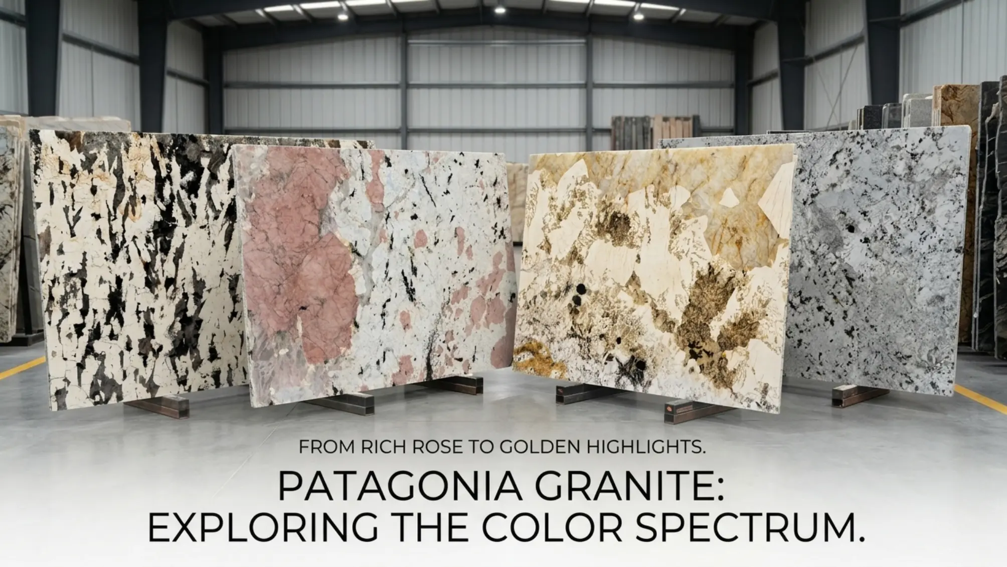
Patagonia Granite does not have one fixed color. Depending on the block and slab, it may show ivory, cream, champagne, honey gold, blush pink, silver grey, charcoal, black and occasional blue-grey or smoky crystal zones. These labels are useful for searching and shortlisting, but the final purchase should always be based on the exact slab face, finish and lighting test.
Why Patagonia Granite can look completely different from one slab to another
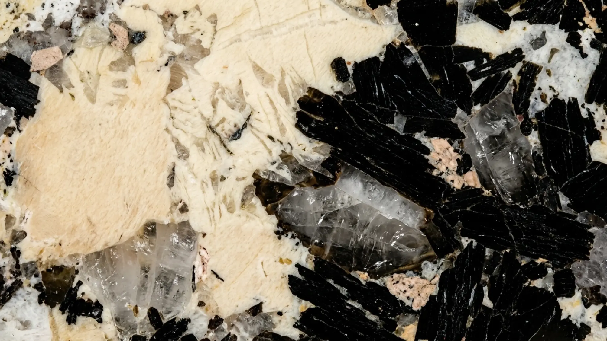
Patagonia Granite is selected for the opposite reason that a uniform engineered surface is selected: it does not repeat. The stone is commonly described in the trade as a Brazilian pegmatitic granite, which means its visual structure is built around unusually large mineral crystals rather than a small, even grain.
Quartz-rich areas, oversized feldspar, dark mineral fragments and naturally healed fissures can form a composition that looks more like an abstract landscape than a conventional countertop pattern. One bundle may be quiet and creamy, while another may show black graphic fragments, rose feldspar, silver fractures or concentrated honey-gold zones.
A small sample is useful for checking polish, texture and local mineral character, but it cannot reliably represent the color balance of a full Patagonia stone slab. For islands, walls and hospitality projects, review the full face and compare all candidate slabs together before assigning cuts.
What colors are common in Patagonia Granite?
The most practical way to discuss Patagonia Granite colors is by visual family. These categories help designers and buyers describe what they want, but they should not replace current slab photos, lot references or dimensions.
| Color family | Typical visual character | Often works well for | Useful pairing direction |
|---|---|---|---|
| Ivory and cream | Soft pale field, milky quartz, restrained dark movement | Large kitchens, calm feature walls, residential islands | Warm white, white oak, walnut, mushroom |
| Champagne and gold | Honey, beige or warm feldspar with gold-toned movement | Luxury islands, bars, hotel reception desks | Walnut, bronze, warm plaster, charcoal |
| Rose and blush | Pink or peach feldspar within ivory, grey or black crystals | Statement furniture, bathrooms, boutique hospitality | Walnut, burgundy accents, warm grey, brushed brass |
| Silver and grey | Cooler quartz, smoky areas, graphite fractures, lower warmth | Modern kitchens, offices, monochrome interiors | Charcoal, light oak, stainless steel, muted blue |
| Blue-toned and smoky | Blue-grey or cool translucent areas mixed with darker minerals | Backlit walls, bars, contemporary focal panels | Black, smoked oak, cool metal, indirect lighting |
| Black-and-white high contrast | Graphic dark fragments against pale crystal fields | Sculptural islands, fireplaces, gallery-like walls | Minimal cabinetry, simple floors, controlled lighting |
Ivory, cream, gold, rose and grey Patagonia slabs
Ivory-dominant slabs are often the easiest Patagonia variation to integrate into residential kitchens. Their pale field keeps the room bright while oversized crystals still create a one-of-one focal surface. Some slabs appear cloud white from a distance and reveal champagne, smoky or black mineral detail only when viewed closer.
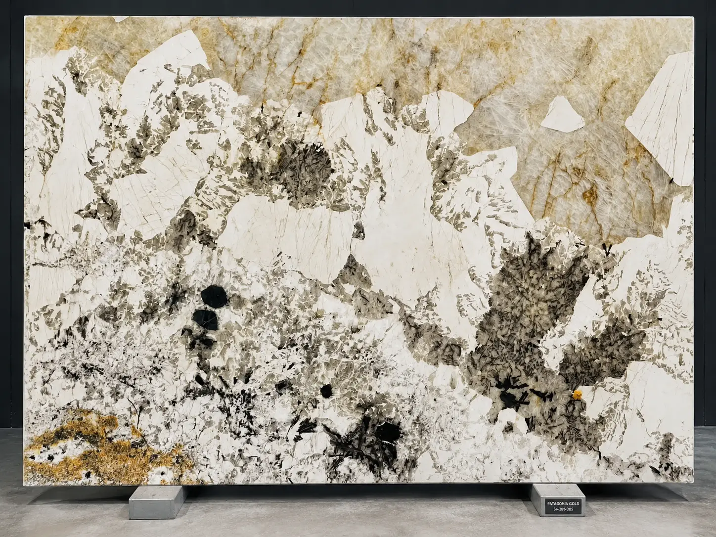
Patagonia Gold Granite is usually a commercial description for slabs with a stronger concentration of honey, amber, champagne or golden feldspar. It is not a single standardized quarry grade. One supplier may use the name for a creamy warm slab, while another may use it for a darker, richer and more dramatic slab.
Rose and blush Patagonia slabs contain pink, peach or salmon-toned feldspar mixed with pale quartz and darker mineral fragments. These tones are sensitive to surrounding materials, so cabinet samples and lighting should be reviewed beside the actual slab.
Grey-dominant Patagonia can range from pale silver clouding to smoky quartz, graphite fractures and broad black mineral areas. It often works in modern interiors where the client wants the mineral scale of Patagonia without a strongly golden overall tone.
What does Patagonia Blue Granite mean?
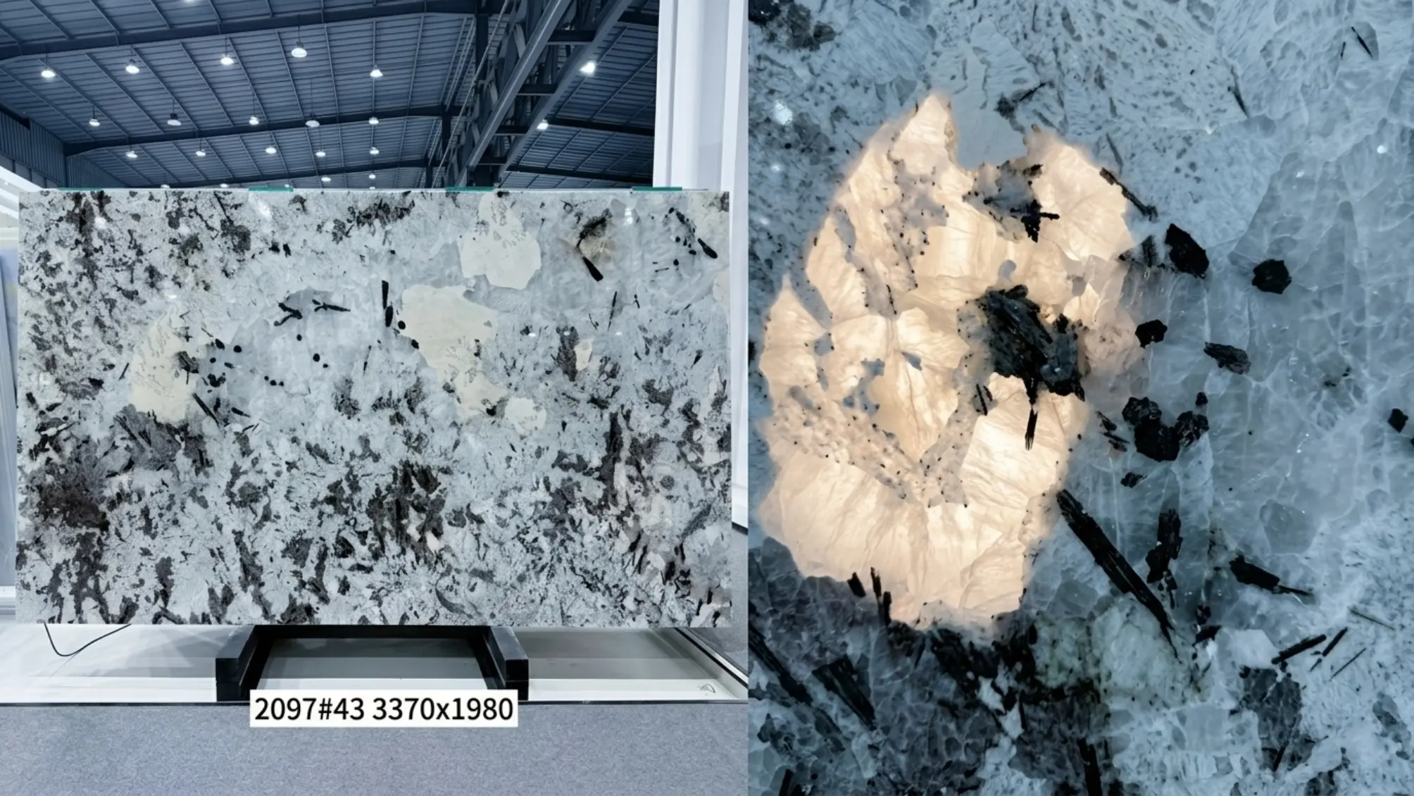
Patagonia Blue Granite is another non-standard commercial name. It may refer to a slab with blue-grey quartz, cool smoky zones, silver mineral movement or dark areas that appear blue under certain lighting. The blue may be subtle in neutral daylight and stronger under cool LEDs or backlighting.
Buyers should ask for daylight photographs, neutral indoor photographs and a short video that moves across the polished surface. If the project depends on a clearly blue effect, the exact slab should be viewed with the proposed lighting system. A name on a quotation is not enough to guarantee the final color impression.
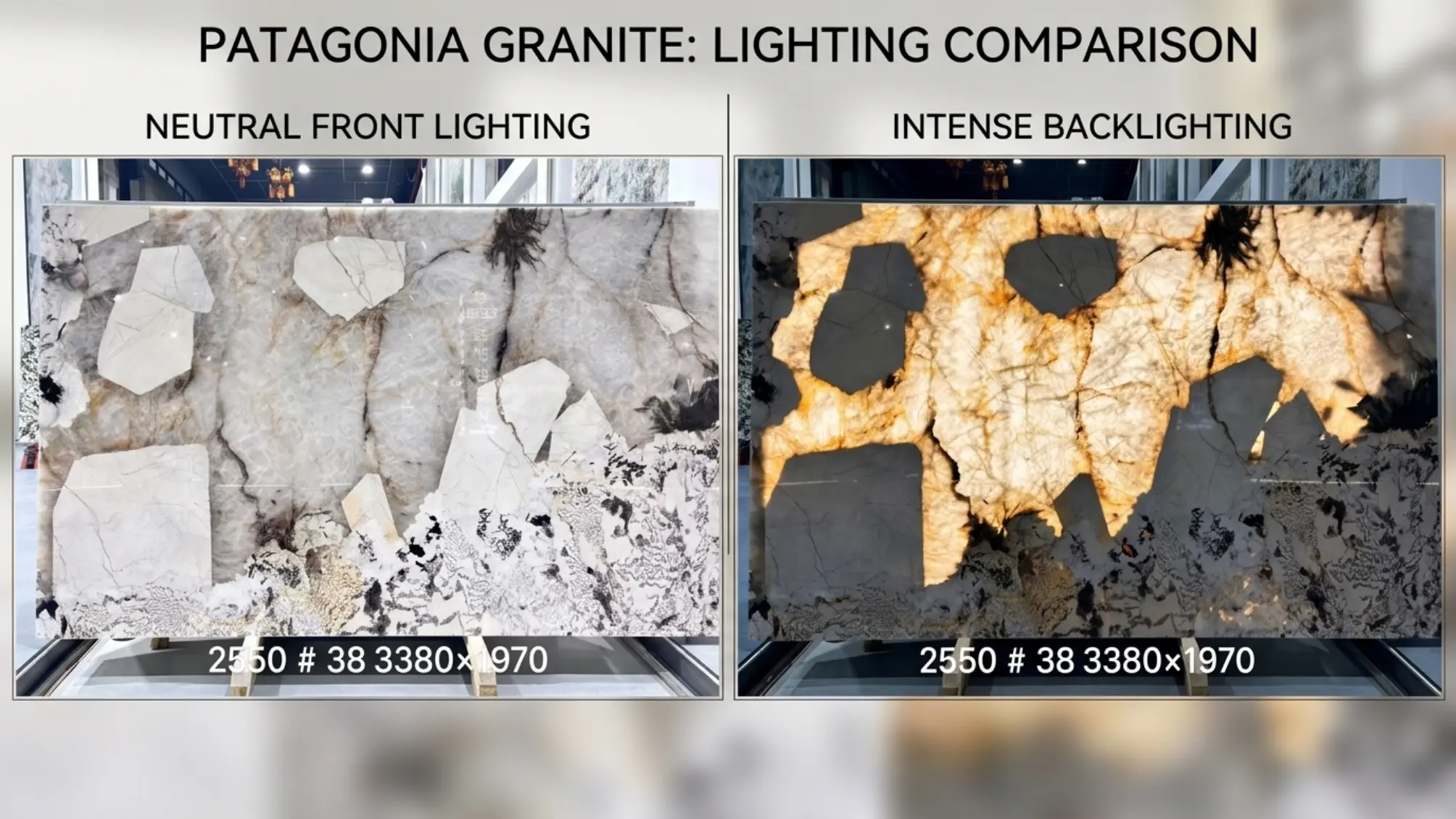
Translucent areas are a lighting characteristic, not a separate color
Some Patagonia slabs contain quartz-rich areas that transmit light. Without backlighting, these zones may look milky white, smoky, pale gold or grey. With a suitable light source behind the panel, the same areas can become luminous and reveal internal crystal boundaries that are not visible in normal front lighting.
Translucency must be tested slab by slab. The lighting system, panel thickness, backing, adhesive color, support structure, ventilation and maintenance access all affect the result. The safest process is to test the exact slab with the proposed light color and panel build-up before fabrication.
How surface finish changes the perceived color
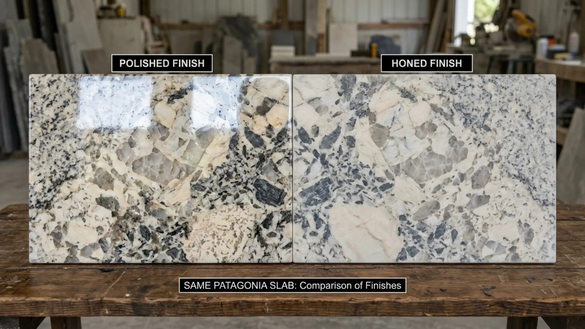
Color selection should never be separated from finish selection. A polished, honed or leathered surface can make the same slab read differently because each finish changes reflection, contrast, tactile depth and the visibility of handling marks.
| Finish | Color effect | Best visual use | Approval note |
|---|---|---|---|
| Polished | Strongest color saturation, contrast and crystal depth; reflects light | Luxury islands, tables, reception counters, backlit focal areas | Review glare, window reflections and edge polish |
| Honed | Softer, calmer and lower contrast; may make warm tones look more muted | Organic modern kitchens, matte interiors, quiet walls | Test oil and handling visibility on the actual slab |
| Leathered | Adds texture and shadow; dark minerals may feel deeper and less formal | Bars, tactile furniture, hospitality accents | Approve texture consistency and cleaning expectations |
| Antique or specialty | Can significantly alter contrast, touch and apparent color | Custom architectural features | Require a physical sample or test area before full production |
How to match Patagonia Granite colors with cabinets and interiors
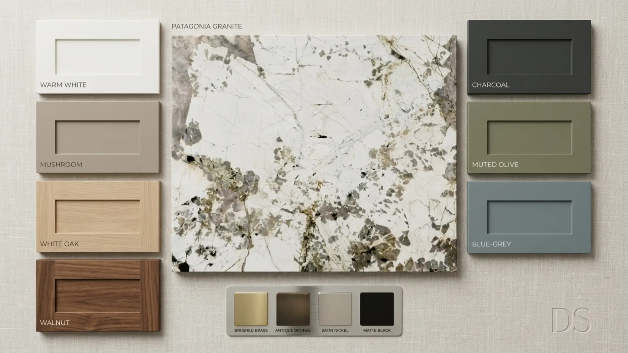
The strongest interiors do not select a cabinet color from the trade name Patagonia. They select it from the actual slab. Identify the slab dominant field, secondary mineral tone and darkest accent, then decide which of those three should be repeated in the room.
Warm white and mushroom cabinets are flexible with ivory, champagne and rose Patagonia slabs. White oak supports creamy and grey slabs while keeping the room relaxed. Walnut is one of the most reliable partners for gold, rose and black Patagonia, and charcoal cabinetry can frame pale crystal fields with a more gallery-like effect.
Muted olive, blue-grey and burgundy can also work when those tones already appear subtly within the slab. The rule is simple: sample beside the stone rather than select from a screen.
How to approve the exact color before ordering
A Patagonia color description should begin the conversation, not complete the purchase. Whether the request is for white Patagonia Granite, Patagonia Gold Granite, Patagonia Blue Granite or a black-and-white slab, use a repeatable approval process.
- Request a straight-on full-slab photograph with all four edges visible and no dramatic color filter.
- Ask for the slab number, bundle or lot reference, dimensions, thickness, finish and available quantity.
- Review close-up images of pale fields, dark minerals, fissures, crystal boundaries, resin-filled areas and slab edges.
- Ask for a short video under neutral lighting so reflection and crystal depth can be judged.
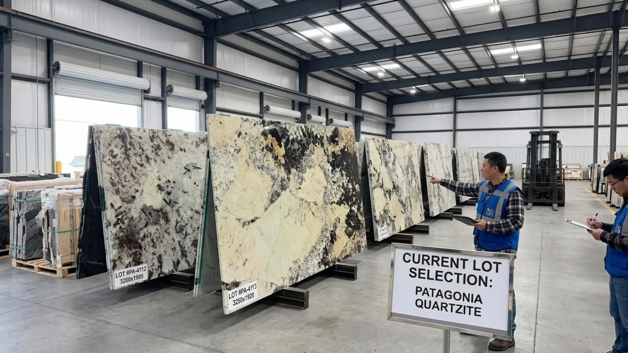
- For a multi-slab project, request a group photograph or digital contact sheet showing candidate slabs together.
- For a backlit project, test the exact slab with the intended LED color temperature and panel system.
- Approve a scaled cut layout before fabrication, especially for waterfall sides, large openings, seams and bookmatched panels.
- Confirm the same slab references again before cutting and include them in the final quotation or production approval.
Planning color across more than one slab
Color consistency in Patagonia does not mean forcing every slab to look identical. It means selecting slabs that can form a coherent composition. For a large island and backsplash, one slab may carry the focal movement while another provides a quieter supporting field.
Before ordering, identify how many full slabs the project truly needs after allowing for cutouts, seam alignment, breakage risk and reserve material. Ask the supplier to mark slab orientation and confirm whether the photographs show the polished face.
The digital layout should be followed by a factory dry layout for fabricated work. This lets the buyer review color transition between the island top, waterfall sides, backsplash, vanity pieces or wall panels before the pieces are packed.
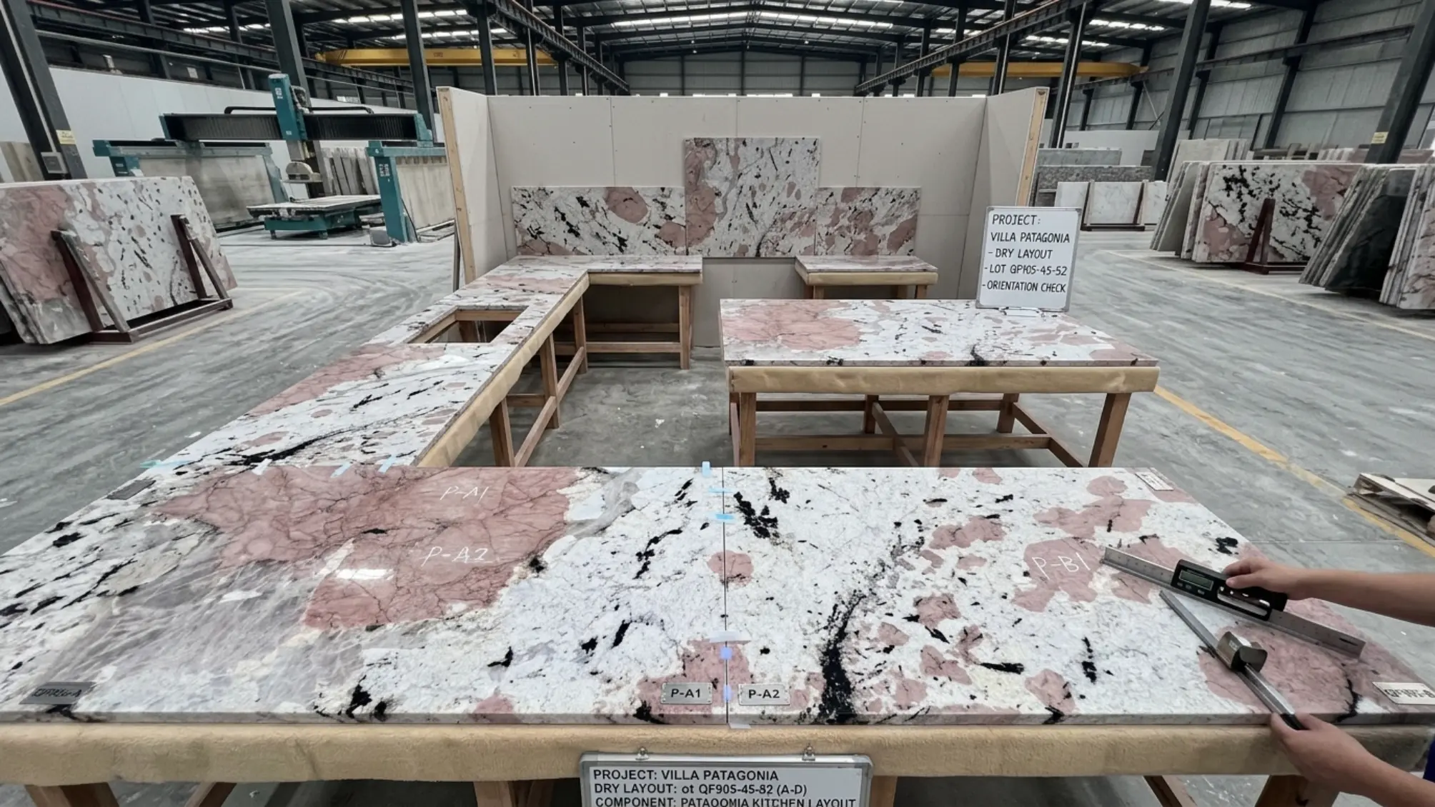
Common color-selection mistakes
Most costly color mistakes happen before cutting begins. A slab can be beautiful and still be wrong for the room if the buyer approves only a name, a sample or an edited photograph.
- Choosing from a small sample and assuming the full slab will have the same balance of white, gold, black or rose.
- Treating Patagonia Gold, Patagonia Blue or similar trade names as standardized grades across different suppliers.
- Approving a heavily edited photograph with boosted warmth, contrast or blue saturation.
- Ignoring finish: a honed slab can look calmer and lighter than the same slab polished.
- Selecting cabinetry before the actual slab is reserved, then discovering that the undertones conflict.
- Buying multiple slabs without comparing them together or confirming bundle sequence.
- Placing sinks, cooktops or seams through the most valuable mineral focal point.
- Assuming every translucent zone will light evenly without testing the proposed LED and backing system.
Patagonia Granite color selection checklist
| Decision | What to confirm | Why it matters |
|---|---|---|
| Dominant color | Ivory, gold, rose, grey, blue-toned or high-contrast | Defines the room palette and search description |
| Exact slab | Straight-on photos, slab number, lot and dimensions | Commercial names do not repeat consistently |
| Mineral scale | Location of large crystals and dark fragments | Affects cutouts, seams and visual balance |
| Finish | Polished, honed, leathered or specialty sample | Changes perceived color, gloss and maintenance |
| Lighting | Daylight, ambient light and optional backlight test | Cool or warm light can change the color impression |
| Multi-slab match | Group photo, consecutive cuts and orientation | Prevents unexpected shifts across large projects |
| Layout | Scaled cutting plan and dry layout | Protects focal zones and color continuity |
| Approval | Signed slab references and final production confirmation | Reduces substitution and communication risk |
Frequently asked questions
What color is Patagonia Granite?
Patagonia Granite can contain ivory, cream, champagne, gold, rose, silver, grey, black and occasional blue-grey or smoky zones. The balance varies significantly from slab to slab, so the exact full slab should be approved rather than relying on one generic color description.
Is Patagonia Granite mostly white or gold?
Both versions exist. Some slabs have a pale ivory or cloud-white field with restrained dark crystals, while others contain stronger honey, champagne or golden feldspar. The trade name alone does not identify the color balance.
What is Patagonia Gold Granite?
Patagonia Gold is generally a commercial description for a Patagonia slab with more prominent warm gold, amber, beige or champagne mineral areas. It is not a universal geological grade, and appearances can differ between suppliers and bundles.
What is Patagonia Blue Granite?
Patagonia Blue usually describes a cooler slab with blue-grey, silver or smoky quartz zones. The blue effect may depend on lighting and polish, so buyers should review neutral-light images and test the exact slab when color is critical.
Are Patagonia Granite color names standardized?
No. Names such as Gold, Blue, Rose, White or Glace may be used differently by quarries, processors and distributors. Use the name for searching, then purchase by exact slab number, photographs, dimensions, finish and lot reference.
Can Patagonia Granite be backlit?
Some quartz-rich zones can transmit light, but translucency varies within and between slabs. Backlighting should be tested on the exact slab with the intended LED color, thickness, backing and panel construction before cutting.
Does a polished finish make Patagonia Granite look darker?
Polishing usually increases reflection, saturation and contrast, so dark minerals may appear deeper and gold or rose areas may look richer. Honing reduces glare and often softens the overall color effect.
What cabinet colors work with Patagonia Granite?
Warm white, mushroom, white oak, walnut and charcoal are versatile starting points. Muted olive, blue-grey and burgundy can also work when those tones appear in the actual slab. Always review physical samples beside the reserved slab.
Can a small sample represent a Patagonia slab?
A sample can show finish and local mineral detail, but it cannot represent the full composition of a large-crystal stone. Approve full-slab images and a scaled layout for islands, walls and multi-piece projects.
How should multiple Patagonia slabs be matched?
Request consecutive slabs or a coordinated bundle where possible, compare them in one group image and approve orientation before fabrication. Matching may focus on color continuity, mirrored bookmatching or a deliberate focal-supporting composition.
Technical care guidance is aligned with the Natural Stone Institute consumer care guidance. Natural stone varies; always confirm performance, treatment and installation requirements for the actual material and project.